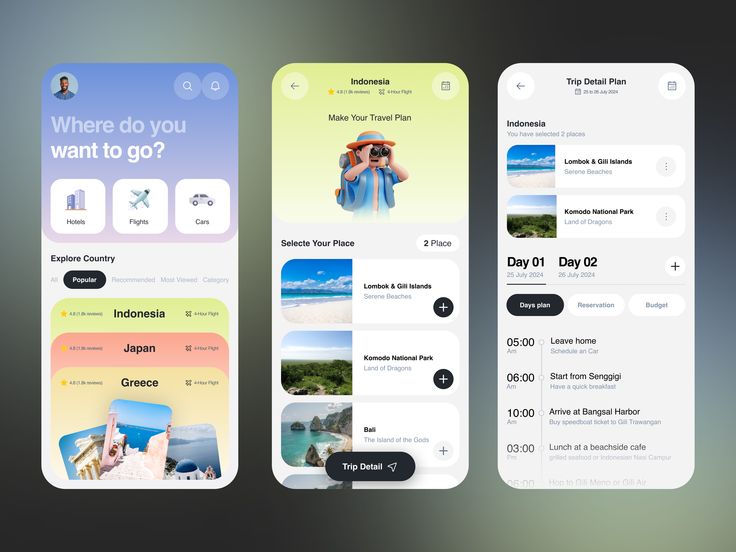
Remember the days when we designed websites for desktops first and then “adjusted” them for mobile? Those days are long gone. In 2025, mobile-first design isn’t just a trend—it’s a necessity.
With over 60% of global web traffic coming from mobile devices (StatCounter), ignoring mobile users means losing customers, engagement, and revenue. Google’s shift to mobile-first indexing years ago was just the beginning. Now, users expect seamless, fast, and intuitive experiences on their smartphones.
In this article, we’ll explore why mobile-first design is non-negotiable, how to prioritize UX for small screens, and the best tools to make it happen.
What Is Mobile-First Design?
Mobile-first design is exactly what it sounds like—you start designing for mobile screens first, then scale up to tablets and desktops. Instead of squeezing a desktop layout into a tiny screen, you build an experience optimized for touch, speed, and simplicity.
Why Start with Mobile?
- User behavior: People scroll, tap, and interact differently on phones.
- Performance: Mobile users expect lightning-fast load times.
- SEO benefits: Google prioritizes mobile-friendly sites.
Think of it like building a house—you wouldn’t design a mansion and then try to shrink it into a tiny home. You’d start small and expand thoughtfully.
📊 Why Mobile-First Matters More Than Ever in 2025
1. Mobile Traffic Dominates
Over 6.8 billion people own smartphones (BankMyCell). If your site isn’t mobile-friendly, you’re alienating the majority of users.
2. Google’s Mobile-First Indexing
Google ranks sites based on their mobile version. If your mobile experience is slow or clunky, your SEO suffers.
3. User Expectations Have Changed
People want:
- Instant loading (under 3 seconds)
- Thumb-friendly navigation
- No pinch-zooming required
4. Better Conversions
A smooth mobile UX = higher engagement, lower bounce rates, and more sales.
Mobile-First UX: Prioritizing User Behavior on Small Screens
Designing for mobile isn’t just about shrinking elements—it’s about rethinking interactions.
Key Mobile UX Considerations:
✔ Thumb-Friendly Zones – Place key actions where thumbs naturally reach.
✔ Minimalist Navigation – Hamburger menus, sticky headers, and clear CTAs.
✔ Fast Load Times – Optimize images, lazy load content, and reduce redirects.
✔ Readable Text – No tiny fonts; use responsive typography.
✔ Touch Targets – Buttons should be at least 48x48px (Apple’s guideline).
Key Principles of Mobile-First UI Design
1. Content-First Approach
Prioritize essential content—cut the fluff. Mobile screens have limited space.
2. Progressive Enhancement
Start with a basic, functional mobile version, then add advanced features for larger screens.
3. Responsive, Not Just Adaptive
Use flexible grids and media queries to ensure smooth scaling across devices.
4. Speed Optimization
- Compress images (WebP format).
- Minimize JavaScript.
- Leverage browser caching.
5. Intuitive Gestures
Swipe, tap, and scroll should feel natural—no awkward hover states.
How Mobile-First Impacts Overall Design Strategy
Going mobile-first changes your entire workflow:
✅ Simpler Designs – Forces you to focus on what truly matters.
✅ Better Performance – Lightweight code = faster load times everywhere.
✅ Future-Proofing – Easier to adapt to new devices (foldables, wearables).
✅ Higher Conversions – A frictionless mobile experience = happier users.
Tools & Frameworks I Use for Mobile-First Projects
Here’s my go-to toolkit for mobile-first design in 2025:
Design & Prototyping:
- Figma (for collaborative UI/UX design)
- Framer (interactive animations)
Development:
- Tailwind CSS (utility-first responsive design)
- Bootstrap 5 (mobile-first grid system)
- React Native (for cross-platform apps)
Performance Testing:
- Google PageSpeed Insights
- Lighthouse (Chrome DevTools)
- WebPageTest
Real-Life Example: Mobile-First in One of My Projects
I recently redesigned an e-commerce site that had a 70% mobile bounce rate. Here’s what changed:
- Redesigned the product grid to show fewer items per row.
- Simplified checkout (fewer fields, Apple Pay integration).
- Optimized images (saved 3 seconds in load time).
- Added a sticky CTA button so users could “Add to Cart” without scrolling back up.
Result?
- Mobile bounce rate dropped to 35%.
- Conversions increased by 22%.
Final Thoughts: Mobile-First Is No Longer Optional
If you’re still designing for desktop first in 2025, you’re already behind. Mobile-first design isn’t just a best practice—it’s the only way to stay competitive.
By prioritizing speed, simplicity, and touch-friendly interactions, you’ll create better experiences for users—and better results for your business.
FAQs About Mobile-First Design
1. Is mobile-first design the same as responsive design?
No. Responsive design adjusts layouts for all screens. Mobile-first means designing for mobile first, then enhancing for larger screens.
2. Does mobile-first design hurt desktop UX?
Not if done right. A well-structured mobile design scales beautifully to desktop.
3. How do I test my mobile-first design?
Use Chrome DevTools, BrowserStack, or test on real devices.
4. What’s the biggest mistake in mobile-first design?
Overloading mobile screens with too much content. Keep it simple.
5. Does mobile-first affect SEO?
Yes! Google ranks mobile-friendly sites higher.
6. Should I use AMP (Accelerated Mobile Pages)?
AMP can help speed, but modern optimization techniques often make it unnecessary.
7. How do I handle complex features on mobile?
Progressive enhancement—start with core functionality, then add extras for larger screens.
8. What’s the best font size for mobile?
At least 16px for body text to ensure readability.
9. Can I use hover effects on mobile?
No—mobile relies on touch, not hover. Replace them with tap actions.
10. Is mobile-first only for websites?
No—it applies to apps, emails, and even wearables.